I am really delighted to see that the new Westfield (the former San Francisco Shopping Center at Powell Station via BART) now is equipped with an interactive directory tool called iDirectory. Replacing the traditional static color-coded map with store directories and floor plans, iDirectory helps people find stores and amenities with a touch of a finger, providing alternative routes (on foot vs. via elevator) in an animated sequence as to show how to get to your destination from wherever you are.
For me the biggest plus is the animated route starting from the "You-are-here" position. Most of us (ok, maybe just vegetable pigeons like me) have a hard time mentally orienting ourselves in an unfamiliar surrounding. East, West, North and South are not so easy to visualize except on a freeway with names such as 101 North or 237 East... The point is, seeing "H&M" on the third floor along with 843 other stores doesn't really help. First I need to know where I am on the map, and then I find the store by one of the two ways: 1. by landmarks (e.g. there is a "Borders" three doors down from "H&M", so I look for Borders since visually it's more familiar to me) and 2. I happen to be standing right in front of H&M. The cool thing about iDirectory is that, not only does it provide users with an animated path, it is also oriented relative to the direction the screen is facing. In other words, if you are looking for H&M at two different screens, you will see two different paths but they both lead to your destination from these two stations. The slowly moving line will show you which way to turn (the good-ol "left" and "right") and approximately how far you have to go from where you are. Now I love the aspect of being in control and have a tool work for me instead of the other way around!
Let's start here...
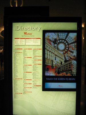 The left side shows all the stores in categories. There is a number next to the store, for instance, 143 Juicy Couture, which doesn't help at all other than that you know the store is on the first floor.
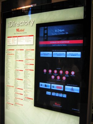
A closer look on the right: three different ways to search

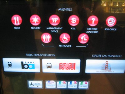
You can also search for amenities. Good use of icon+text combination.
Let's try search by category

Or search by store name...

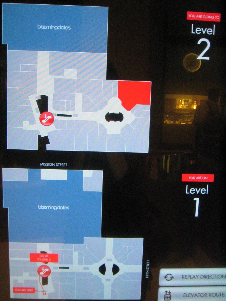
The screen is divided in halves. I like the mental model adopted here to reflect that the higher levels are on top. In this scenario, the visitor is on the first floor but wishes to go upstairs to level 2. The lower half shows where the visitor is currently with succinct directions.
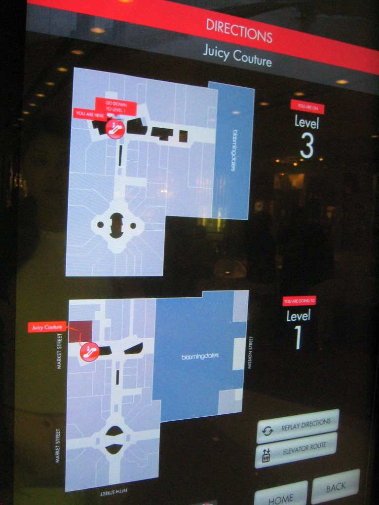
 In this other scenario, the visitor is on the third floor but wishes to get to a store on the first store. The lower half shows the destination store in purple and its relative position from the elevator.

Detail look A:

Detail look B:

Zooming in on the animated path.
 You can replay the directions or choose to get there by a route via the elevator.
 The biggest annoyance however is its feedback mechanism or rather, the lack of it. There is a cute click sound accompanying every action triggered by the user's finger touch, but you really have to listen for it, something that's really hard to do in a public space so crowded and noisy. If you want to navigate to home or go back by pressing the respective "Home" and "Back" buttons, it appears that nothing happens and the screen stays the same, unresponsive for at least a couple of seconds. There is no visible or audible indication that the iDirectory is working on taking you "Home" or "Back". Just when you are wondering if you have indeed pressed on the button hard enough and starting jabbing the buttons repeatedly, the screen changes. People’s frustration and doubt are obvious not just on their faces but also in the many fingerprints clouding around areas where the navigation buttons appear on screen.
 Another thing I don't like is a bit subtle. I hung around waiting for M to come out of her favorite store and I started noticing something interesting. Due to its interactive nature, iDirectory can only offer help to one user at a time. Yes there are many of them installed, but then we wouldn't want to use the iDirectory to locate the iDirectory now, would we? After a while it appears that instead of getting people to their destinations faster, the iDirectory tools collect crowds of confused people waiting politely to use the service. How useful is a tool if it cannot be used? The traditional directory maps in other malls at least have this on their side: many people can use it at the same time although it’s not as easy to use and/or you need to have good eye sight to read over people's shoulders. What would be nice is to employ both the static directory maps and iDirectory.
Labels: design of everyday things